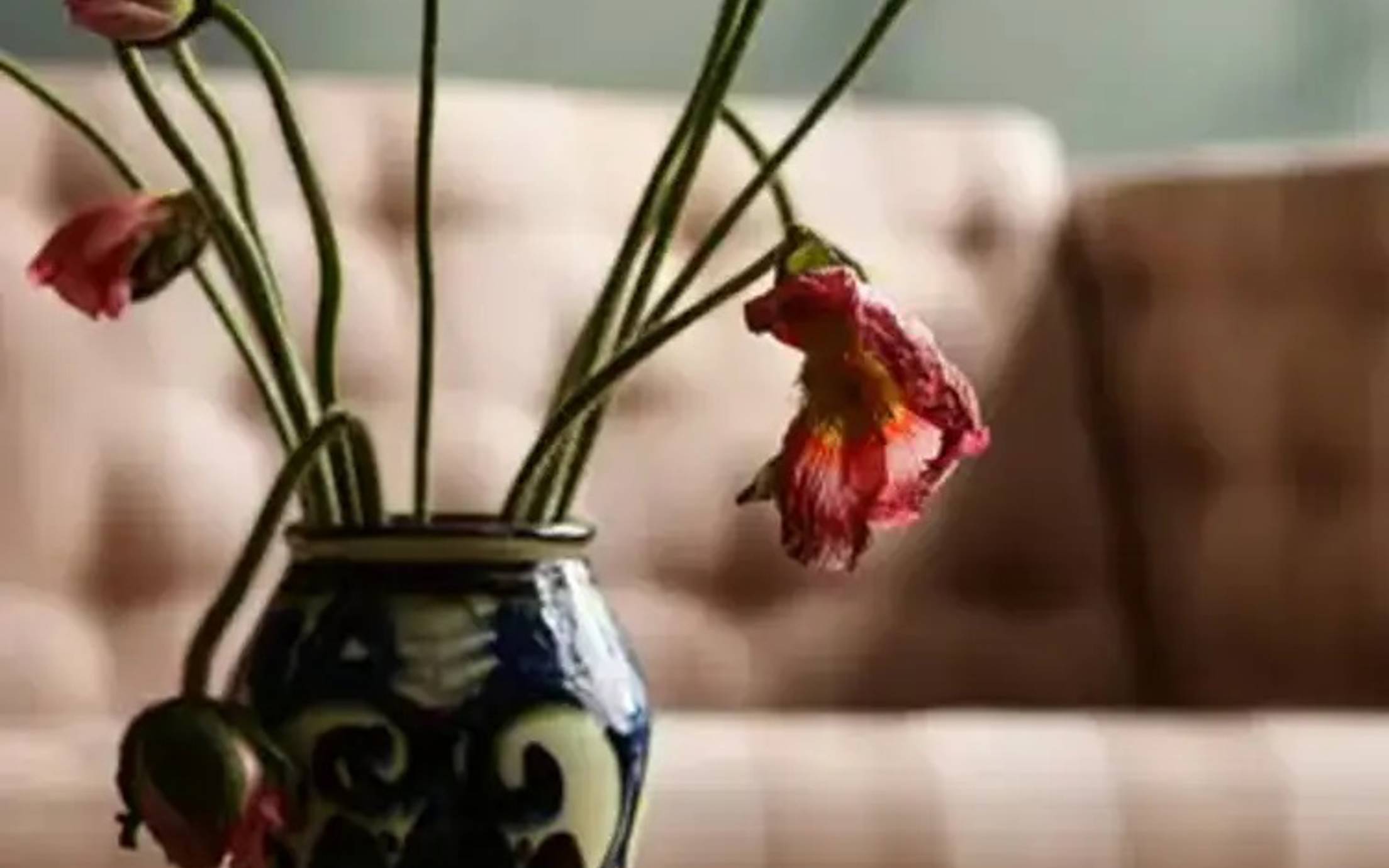
Passage of time
Rich, classic hues at the darker end of the spectrum, such as sophisticated reds and greens.
Latest Colour Chart From Jotun
Surround yourself with colours that reflect and enhance your personality and passions. Fill your home with colours tailored to make your home a soulful space where you find calm and energy.
Surround yourself with colours that reflect and enhance your personality and passions. Fill your home with colours tailored to make your home a soulful space where you find calm and energy.
Colours have an exceptional ability to influence our moods and emotions. They can uplift or calm us down, make us feel safe and serene or energised and creative. Jotun's 2026 colour chart, Soulful Spaces, is designed to help you discover the shades that best express your personality and style, transforming your home into a personalised sanctuary.
Featuring 24 beautiful colours, Jotun's 2026 colour chart Soulful Spaces has been thoughtfully curated to both inspire and comfort, with hues that seamlessly integrate into contemporary lifestyles.
The colour chart is organised into three unique themes: Passage of Life, Art of Stillness and Joyful Living, each filled with the inspiration you need to transform the atmosphere of your kitchen, bedroom, living room or any other space in your home with colour.
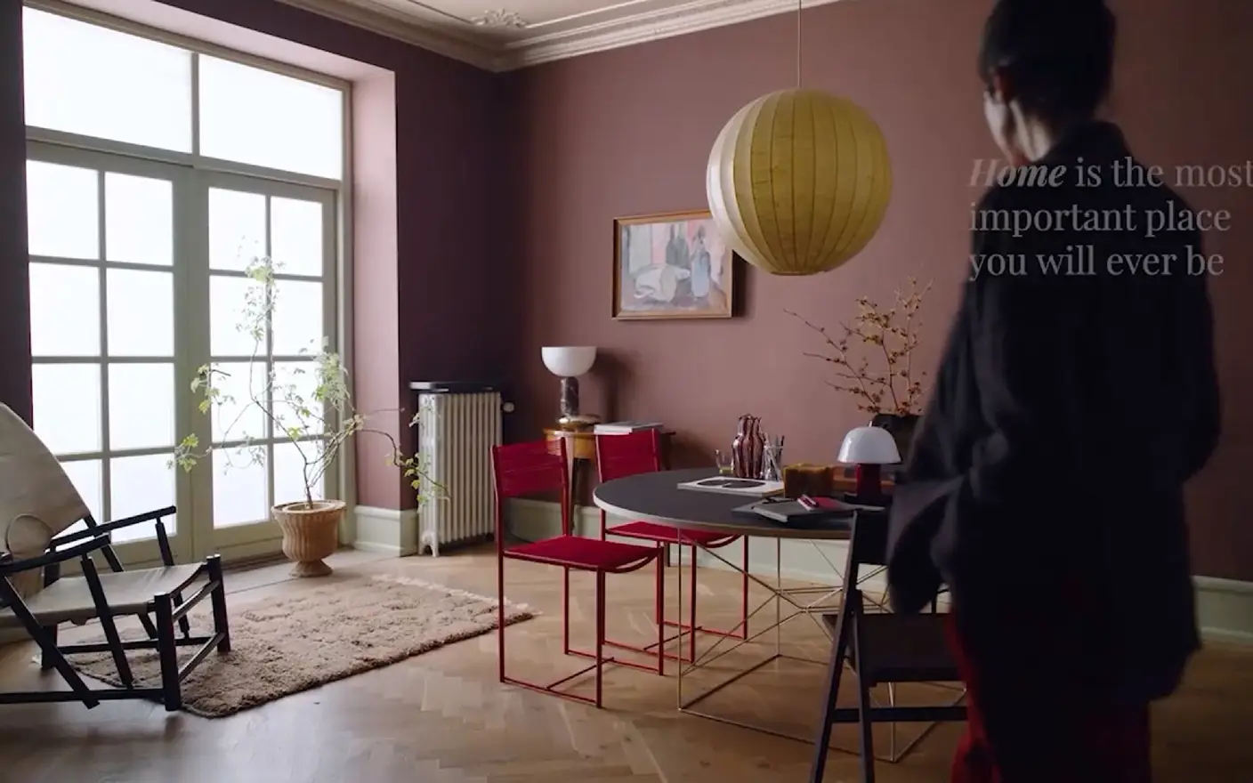
The colours that surround us have an impact on our moods and well-being. The colours we choose for our home is no exception. However, finding the perfect shades for our interiors can sometimes feel like a daunting task. But don't worry — Jotun makes exploring colour enjoyable.
With Jotun's 2026 colour chart, Soulful Spaces, we guide you in selecting and combining colours and textures to design a space that truly reflects and inspires you every day. Follow our guidance and discover how choosing colours can be an enjoyable, fulfilling and creative experience.
Looking for last year's colour chart — Nuances? Find it here!

Rich, classic hues at the darker end of the spectrum, such as sophisticated reds and greens.
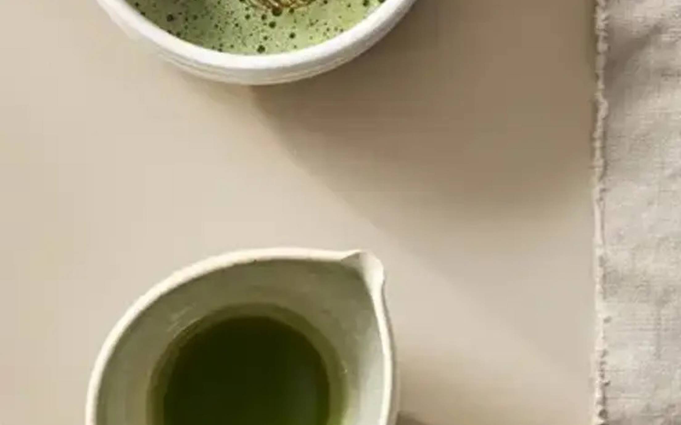
Lighter tones and newly introduced golden beige shades, ideal for creating a peaceful and restful atmosphere in the home.

Celebrates colours rooted in nature, inviting vibrant leafy greens, soft pinks, and earthy light tones into your living space.
20362
pink ambienceA soft, golden pink.
2951
sophisticated redA deep, elegant red.
2149
coffeeA deep, brownish red.
1974
golden walnutA golden brown.
7613
northern mysticA dark, muted green.
8493
green teaA golden green.
1303
observeA warm, brownish, golden tone.
12313
soft dunesA golden beige.
6378
iconicA muted, bluish green.
6379
cityscapeA muted, bluish green.
6194
wild ivyA muted, bluish green.
1965
ginger teaA muted, greenish yellow.
1625
soulA warm golden white.
12308
unbleachedA golden beige.
12300
hazelnut beigeA golden beige.
12292
caramel brownA golden beige.
12079
gleamA muted, greenish yellow.
12080
soft radianceA muted, greenish yellow.
10963
golden bronzeA golden brown.
8284
oliveA yellowish olive green.
8597
seaweed greenA yellowish olive green.
20054
silky pinkA muted pink.
11220
ochre clayA yellow ochre.
11202
mild ochreA warm, pale, ochre yellow.
Jotun의 장식용 페인트는 전 세계의 많은 국가에서 사랑받고 있습니다. 귀하의 국가에서 Jotun 페인트가 제공되는지 확인하려면 아래의 목록에서 해당 지역을 선택하십시오.

Jotun's new colour collection for the 2025 season, Nuances, celebrates the impact of subtle shades.

From our clothes to our homes, the colours that we surround ourselves with are a reflection of who we are and how we want to feel. In tribute to the art and science of colour, Jotun presents 23 colours for 2024.
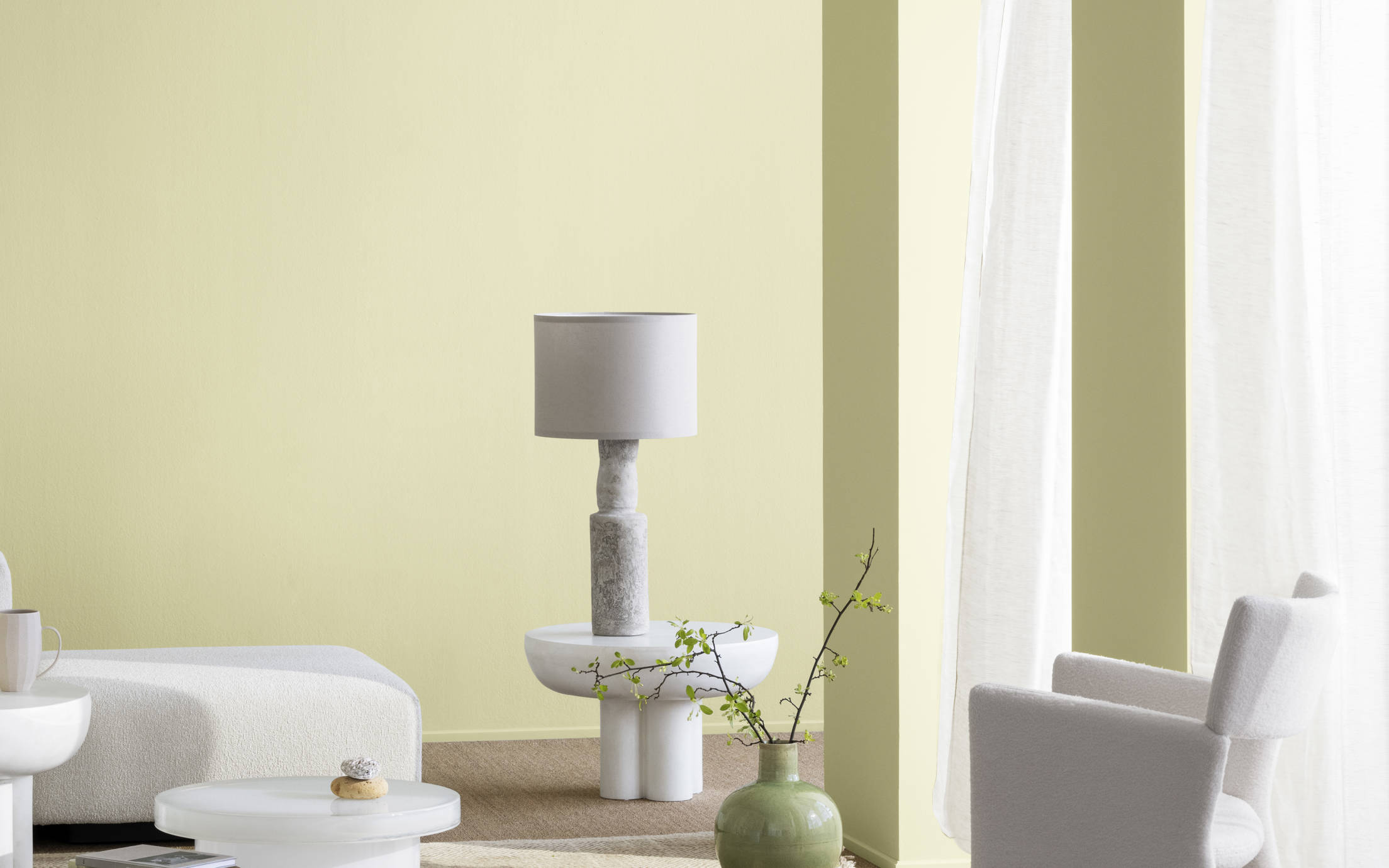
스토리(Stories) 컬렉션 2023은 실내 장식의 독창적인 표현에 영감을 선사할 수 있도록 제조된 표현력이 풍부하고 희망에 찬 색상으로 구성되어 있습니다.

Jotun의 투게더(Together) 컬렉션은 유행을 타지 않는 색채를 보완하여 새로 개발된 다양한 색상으로 이루어져 있습니다. 28가지 색조를 믹스 앤 매치하여 휴식을 취하고, 에너지를 재충전하고, 영감을 얻는 인테리어를 연출할 수 있습니다.

당사의 모든 색상은 Jotun 제품을 위해 특수 제조된 고유한 제조법으로 개발됩니다. Jotun의 제품 및 안료를 사용한 경우에만 정확한 연색성이 보장됩니다. 기판, 광택, 조명 조건 및 기타 제품 마감은 색상의 외관에 영향을 줄 수 있습니다. 화면 설정 및 운영 체제의 차이로 화면에 표시되는 색상이 결과와 달라질 수 있습니다. 디지털 색상은 가이드로만 제공됩니다.
동영상 표시 중
이미지 표시 중
A brochure is being displayed