


포용력
중요한 순간을 위한 공간 만들기
 Global site

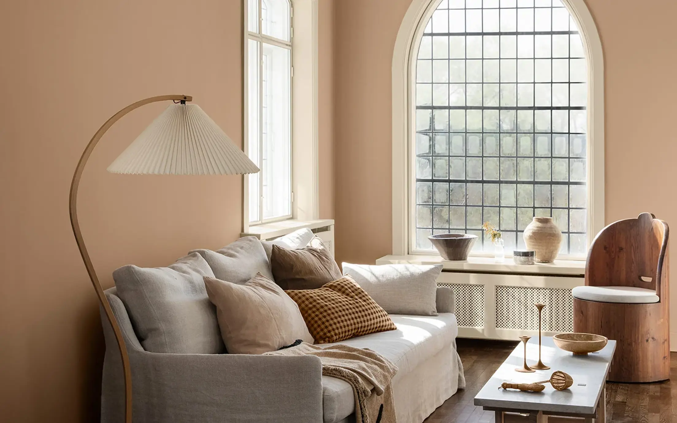
Jotuns Together collection is a range of newly developed colours complemented by timeless hues. The 28 shades are designed to be mixed and matched to create interiors that relax, energise, and inspire.
Jotuns Together collection is a range of newly developed colours complemented by timeless hues. The 28 shades are designed to be mixed and matched to create interiors that relax, energise, and inspire.
Jotun은 2022년의 색상인 '투게더(Together)'를 발표했습니다. 이는 당사의 방대한 아카이브에서 엄선된 유행을 타지 않는 색채를 보완하여 새로 개발된 색상으로 구성된 컬렉션입니다. 믹스 앤 매치할 수 있도록 제조된 28가지 색조를 제한 없이 자유롭게 조합하여 휴식을 취하고, 에너지를 재충전하고, 영감을 얻는 21세기형 인테리어를 연출할 수 있습니다.

"사람은 사회적 동물이며, 인류는 타인과의 연결을 통해 번성합니다. 친구 및 가족과 함께 보내는 시간은 우리의 삶을 풍요롭게 하여, 몸과 마음의 건강에 검증된 이점을 선사합니다. 함께 있는 것만으로도 더 오래 행복한 삶을 사는 데 이롭습니다.
많은 분이 그렇겠지만, 지금만큼 서로 더 끈끈하게 연결되어야 할 필요성을 느낀 적은 아마 없을 것입니다. 서로 함께 이야기하고, 웃고, 수다를 떨거나 다정한 침묵의 순간을 공유하기 위해서 말입니다. 다른 사람과 같은 공간에 있는 것만으로도 기분이 좋아지거나 새로운 아이디어가 떠오를 수 있습니다."
Jotun, Global Colour Manager, Lisbeth Larsen
중요한 순간을 위한 공간 만들기

대담하게 독창성을 발휘할 자유

깊게 생각하고, 간직하고, 다시 연결될 수 있는 공간
1875
senseBeige, a color of neutrality, is perceived as practical and orderly. It complements other earthy colours by providing a subtle balance.
1303
observeA yellow-beige tone. This is a yellowish beige tone that will come across as far more golden than traditional beige tones. It fits in somewhere between beige and yellow.
0280
caravanA yellow-brown ochre tone. This is an old favourite from Jotun’s archives, and by way of comparison with something more familiar, we think LADY Caravan is a lighter version of 10683 Cashmere, whilst being a little redder and warmer than 10961 Raw Canvas.
1909
chalk ochreA warm tone of ochre. This is a warm, subdued and modern ochre tone. It almost feels like lime, with its rustic and genuine appearance.
11130
shadeA warm grey-beige tone. This is a lovely, warm tone, something between grey and brown.
1876
wild earlBeige, a color of neutrality, is perceived as practical and orderly. It complements other earthy colours providing subtle balance.
12179
embraceA warm terracotta colour. An incredibly lovely, happy terracotta tone that encompasses the room. The perfect mix of pink and orange, bringing a feeling of positivity and warmth into the room.
1259
rustyA burnt, reddish-orange tone. LADY Rusty is a rustic terracotta tone able to bring joy and an earthy, natural atmosphere.
5516
iron blueA coarse blue-grey tone. This is an outstanding blue tone with a greyish expression, giving it a slightly coarse and industrial expression. It’s great on its own, but also makes an exciting contrast to a number of other hues.
7236
jazz whiteWhite, a colour of purity, suggests goodness and innocence. Its elusive nature provides a sense of serenity and the essence of perfection.
6383
imagineA bright, turquoise tone. This is a stunning turquoise tone, which is relatively pure and bright in its appearance.
6384
wishA bright, turquoise tone. 6384 Wish is a happy turquoise colour falling right between 6383 Imagine and 6084 Sea Emerald.
6084
sea emeraldTeal, a beautiful mix of blues and greens, takes the best qualities of each colour. It is versatile, and can be either striking or soothing depending on its application.
8565
hopeA lovely, bright green tone that can be described as springlike, lush and sharp. It’s actually a green tone that is much brighter than the subdued green tones we’ve seen in recent years.
0125
palm leafGreen, a colour of life, represents freshness and security. While it creates a restful atmosphere, it also possesses the intense power of nature.
20186
lavender touchA dusty tone of lavender. This is a greyish lavender tone, and a little cooler in its expression. Lavender is a key trend this season, and Lavender Touch is no exception.
10235
summer sunA lively yellow tone. This is a bright yellow tone able to fill the room with sunshine and positivity. Bringing yellow tones into the interior can feel like a shot of vitamins!
3377
slate lavenderA subdued purple nuance. The colour is greyish and a bit cool in appearance. Works well with cool grey nuances such as 9911 Platinum and 9930 Jazz Grey, but is also nice with warmer grey nuances such as 1032 Iron Grey, 1973 Objective, 1269 Dawn, 12077 Sheer Grey or 12078 Comfort Grey. Some people appreciate the combination lavender and green, and 7628 Treasure and 7629 Antique Green are nice alternatives.
1376
mistA warm greyish white
12180
presentA subdued, greige tone. This is a reddish subdued tone, able to bring warmth and softness to the room.
12181
soft comfortA warm grey-beige tone. This is a lovely soft subdued tone, able to combine the best from the grey and the brown.
12182
gentle whisperA light, greige tone. Gentle Whisper is a mellow, greige colour in which hints of beige and grey can be clearly seen. Undertones become clearer in lighter tones such as this.
20185
friendly pinkA dusty pink nuance. Kind and soothing.
20184
thoughtfulA rose-tinted earth tone. Caring and calming.
2011
antique brassA happy, peach pink tone. A lovely, positive and elegant peach pink tone. It can bring out the best in a subdued palette, or create its own atmosphere all on its own.
2040
light graniteA golden, pink tone. This is a livelier version of 10580 Soft Skin, but can also be described as lighter than 2024 Senses and more greyish than 2782 Deco Pink.
8281
pale lindenGrey is perceived as long-lasting and classic. It's an ideal background colour, and yet still carries authority. Grey also works well with flashy or colourful décor.
Jotun의 장식용 페인트는 전 세계의 많은 국가에서 사랑받고 있습니다. 귀하의 국가에서 Jotun 페인트가 제공되는지 확인하려면 아래의 목록에서 해당 지역을 선택하십시오.

같은 공간에 다른 사람들과 함께 있는 것만으로도 새로운 아이디어가 떠오르고 즐거워질 수 있는 것과 마찬가지로, 색채는 우리의 마음을 차분하게 하거나 열정을 불러일으키고, 정신을 맑게 하거나 창의력에 시동을 거는 힘을 갖고 있습니다. Jotun은 주변을 둘러싼 다양한 색조가 일상생활을 형성하는 방식에 깊은 관심을 갖고 있습니다.
올해 Jotun에서 개발한 각각의 색상 테마는 개개인의 다양한 정체성과 라이프스타일을 반영하고 강조하고 있지만, 이 모든 테마는 타인과 함께 시간 및 공간을 공유하고자 하는 인간의 보편적인 욕구에 기반하고 있습니다. 우리는 결국 함께 있을 때 더욱 빛나는 존재입니다.

Jotun 브로슈어에서 2022년 색상을 확인해 보십시오.

Jotun's new colour collection for the 2025 season, Nuances, celebrates the impact of subtle shades.

From our clothes to our homes, the colours that we surround ourselves with are a reflection of who we are and how we want to feel. In tribute to the art and science of colour, Jotun presents 23 colours for 2024.

스토리(Stories) 컬렉션 2023은 실내 장식의 독창적인 표현에 영감을 선사할 수 있도록 제조된 표현력이 풍부하고 희망에 찬 색상으로 구성되어 있습니다.

Jotun의 리디스커버(Rediscover) 컬렉션은 다양한 흙빛에서 유행을 타지 않는 색채, 아카이브에서 엄선한 미니멀한 색조에 이르는 폭넓은 색상으로 이루어져 있습니다.
당사의 모든 색상은 Jotun 제품을 위해 특수 제조된 고유한 제조법으로 개발됩니다. Jotun의 제품 및 안료를 사용한 경우에만 정확한 연색성이 보장됩니다. 기판, 광택, 조명 조건 및 기타 제품 마감은 색상의 외관에 영향을 줄 수 있습니다. 화면 설정 및 운영 체제의 차이로 화면에 표시되는 색상이 결과와 달라질 수 있습니다. 디지털 색상은 가이드로만 제공됩니다.
동영상 표시 중
이미지 표시 중
A brochure is being displayed